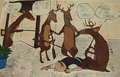
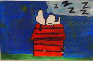
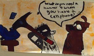
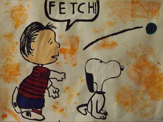
Happy Hunting
by Madalyn Harvey
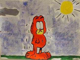
My comic painting, "Happy
Hunting", incorporated the style of Pop Art and a comic from
James Watterson's "Calvin and Hobbes" comic strip. Pop Art was
mainly seen in the 1960's with artists such as Roy Lichtenstein
and James Rosenquist painting commercial images in the comic
strip style. In "Happy Hunting." I used the dots that were so
present in his art as the background of the "Calvin and Hobbes"
frames.
Painting
this was challenging for me because there are a lot of different
aspects of the painting that you can't do all at once. All of
the dots had to go on last, so ensuring the painting detail
itself wouldn't be dotted was crucial. It also took a lot of
time to outline everything in black, in accordance with the pop
art style.
"Happy
Hunting" was selected as the title because I chose to paint it
on the opening day of hunting season, and thought it would be a
funny title to show if the situation was reversed people would
hate hunting season. |

 |
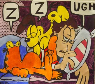
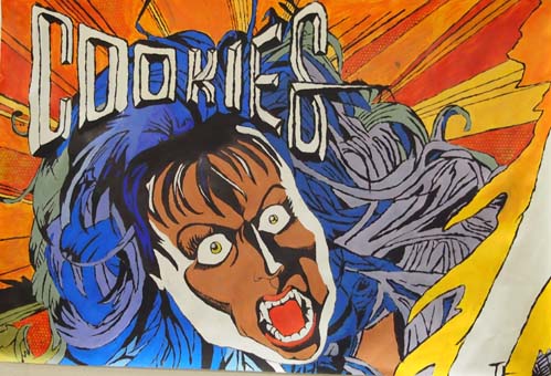
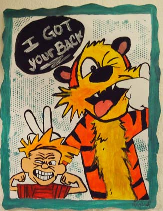
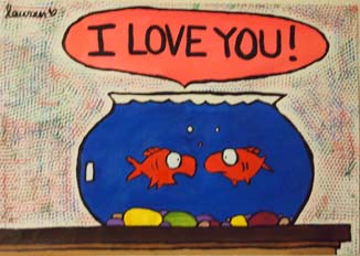
Pop Art
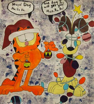
by Cordell Williams
I went through many comics
to find the one that attracted me the most; A can, that most
represents me. I then drew a grid on a large piece of paper then
scaled the comic to fit. I used the same colors as the comic.
The only two things I changed were the dots and the bubble. The
dots were supposed to be a cabinet, and there was no bubble
originally.
Over all I think my painting
turned out awesome. The painting looked almost exactly how I
envisioned. I struggled only .... with the dots. They were not
my favorite part of the painting and definitely not easy. I
believe the painting is a direct representation of myself.
I chose the saying in the
bubble because that's how I felt that cat would feel. In my
painting you might assume that the cat stole the dog's collar.
But in the original strip, he was wearing it. |